Good Money
Mobile Banking App – Consumer – In-house
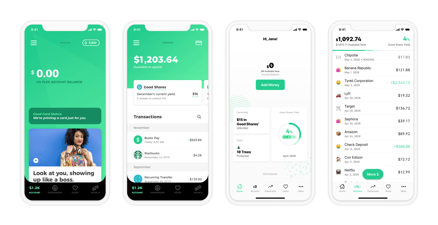
Good Money was a neobank that aimed to provide ethical and sustainable banking services. Customers earned an ownership stake in the company by using the services.
Problem
Good Money, like many other digital banks, generated most of its revenue through interchange fees. Customers needed to use their Good Money-sponsored debit cards frequently to maintain profitability.
My objective was to develop a mobile banking app that would attract customers who prioritize socially responsible causes and environmental sustainability while also incorporating the concept of shared ownership.
ROLE
Lead Product Designer
TEAM
4 Designers
2 PMs
Third-Party Engineers
Approach
The main areas of focus for the Good Money app were as follows:
Gamifying Ownership
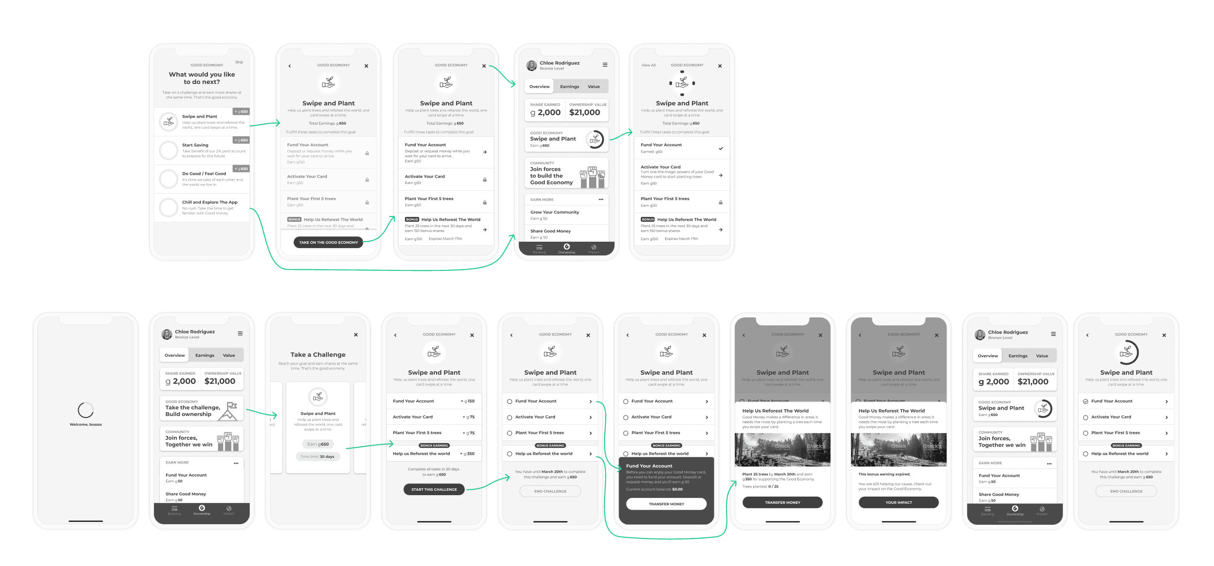
My first task was to design the equity gamification model to engage customers in earning early shares of Good Money and hope for a later financial pay out.
However, research proved that to be misguided. After a few interviews over Zoom it became clear that people were more interested in supporting the mission than building equity in an unproven startup.
Prototyping Everything
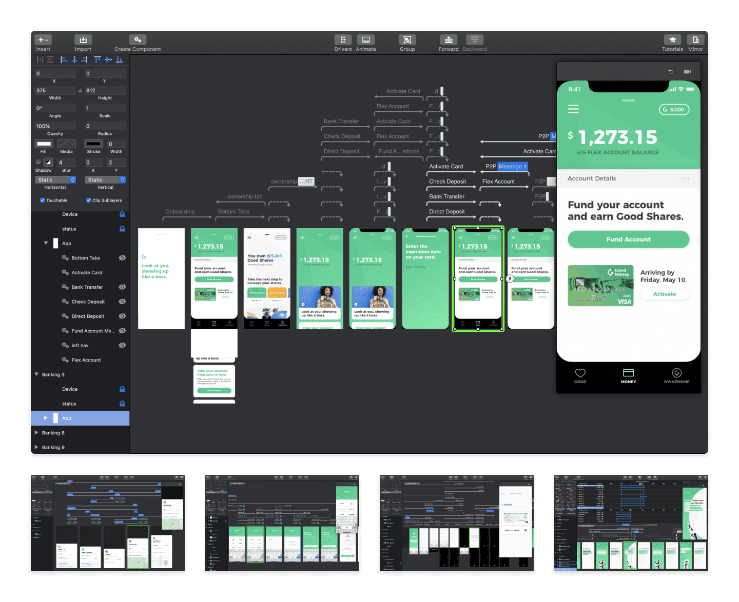
As we were building flows, I built prototypes in Invision and Principle to test our assumptions and share interaction details with our engineering team.
Existing and potential investors were curious to see our progress. So I created an app demo for them to play with and get a feel for what we were building.
The demo, built in Principle, covers 80% of the app functionality and allowed for multiple paths. This helped us secure multiple round of investments worth several million dollars.
Making It Feel Safe
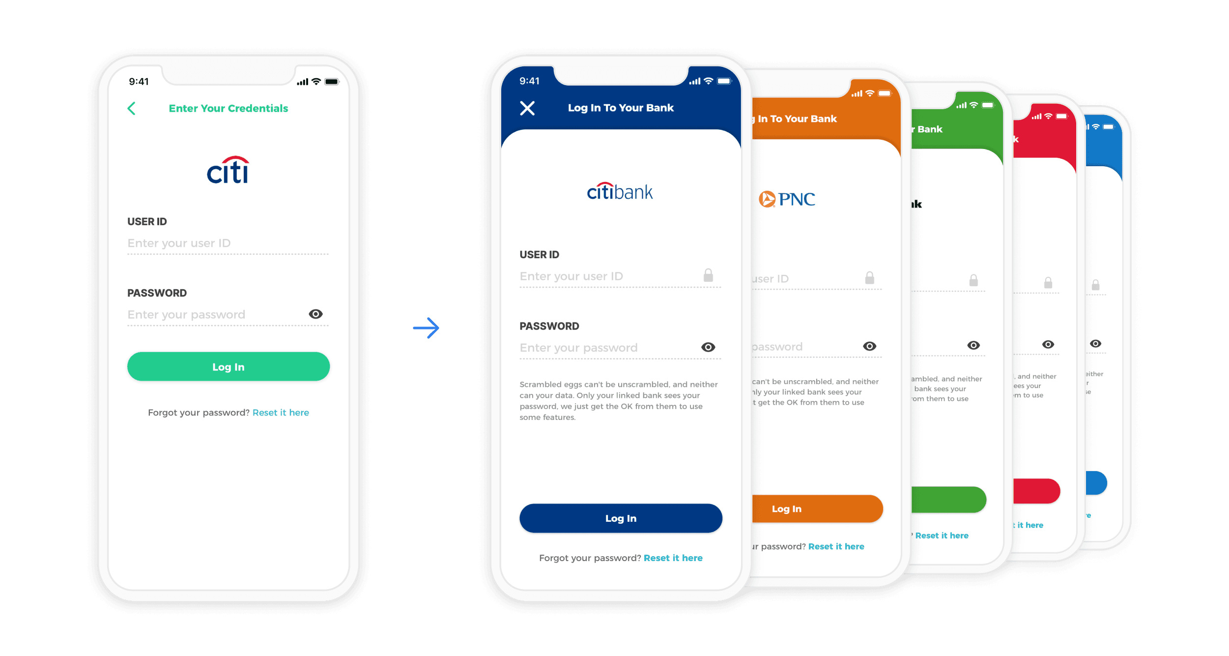
Once we started getting analytics, we noticed that people were dropping off the sign up funnel when we asked them to link their bank. Additional researched showed that people didn’t trust the screen – “it looked fishy”.
One hypothesis was the bank login screen was too generic. After exploring our partner’s API I found that we could get branding colors; but it wasn’t always useable. So I wrote a script to account for missing colors and contrast issue to ensure the screen would look good for every banks. We shipped it and saw encouraging metrics.
Designing System(s)
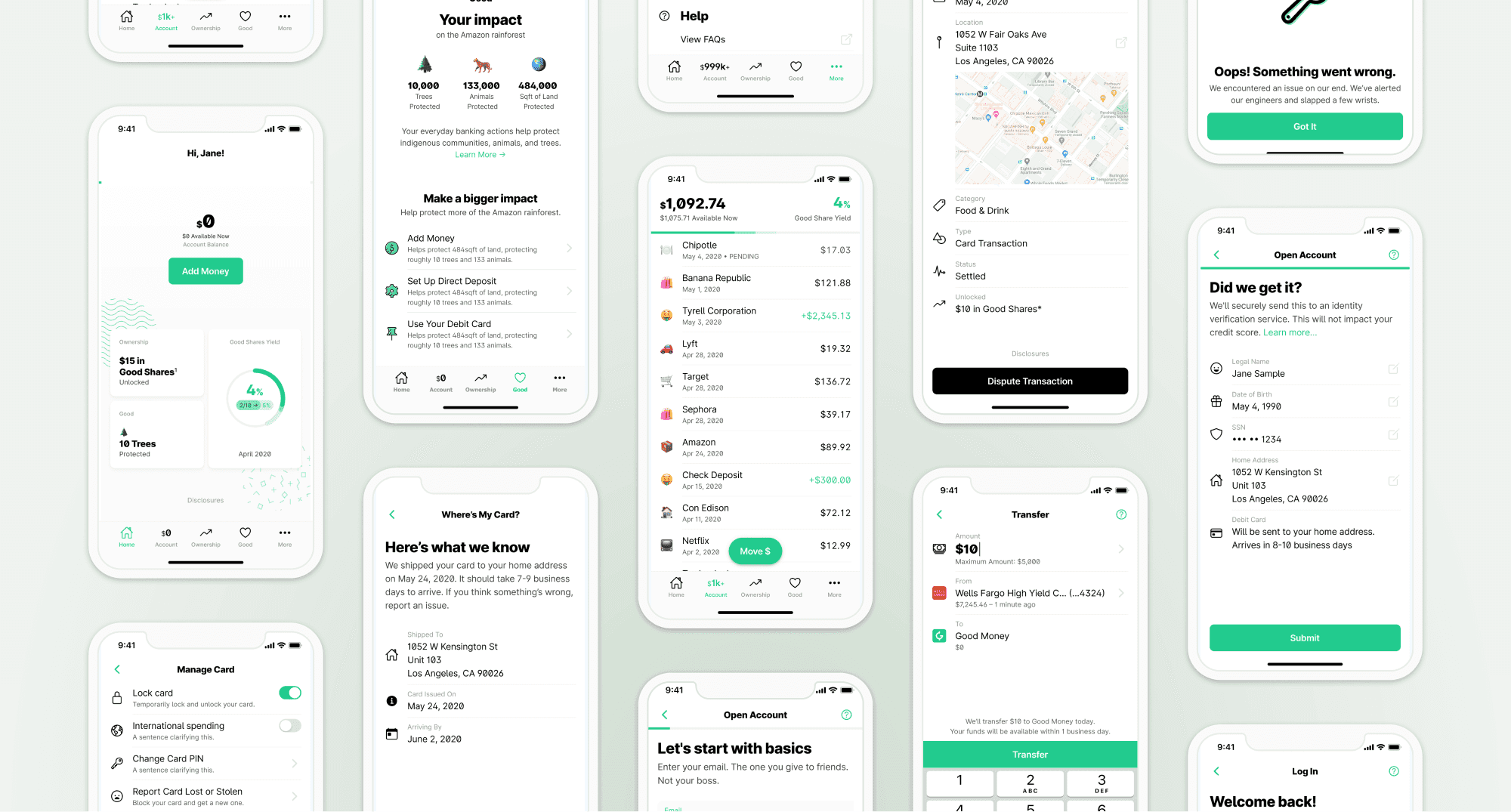
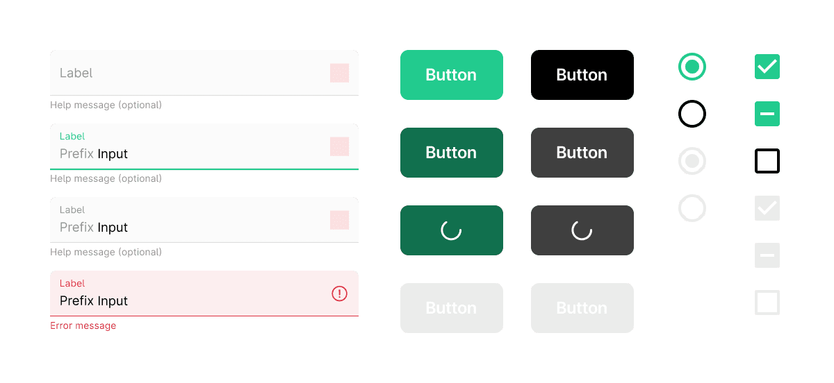
In the initial version of the application, there were no patterns and reusable components, and research conducted in the early stages of development revealed usability issues, including color contrast.
To address these issues and improve the development process, we opted for Flutter to build the second version of the app. We also created a design system that would enhance collaboration and speed up development.
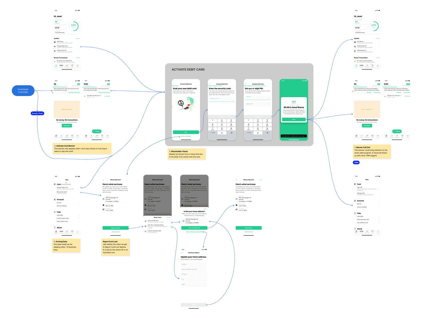
All UI specifications were documented in the design system and referred to in the larger user flow to keep it organized.
User Flows
I collaborated with engineers, business partners, legal and other stakeholders to create user flow documentation for each user story. This documented the UI, logic, and other experience-related information.
Outcome
Despite customers being very enthusiastic about Good Money's mission and the app, they were not ready to abandon the incumbents' services. Ultimately, customer acquisition was too high and too slow to match the business's needs, which led Good Money to cease operations.
Takeways
When engineers are involved in creating and implementing design systems, they gain a deeper understanding of the design principles and rationale behind them, leading to smoother integration and execution.
Clear design documentation ensures alignment across teams and facilitates seamless collaboration throughout the project lifecycle.
