Stash
Investing Mobile App – Consumer – Agency Work
Stash is an investment platform that offers easy-to-understand investment options that align with customers' interests
Problem
Traditional platforms were complex and inaccessible to many younger investors. Stash, by offering micro-investing services, aimed to simplify investing and make it more accessible to a broader audience.
Stash needed an app-based platform that would stand out from the status quo, with a beginner-friendly interface and a range of educational content.
ROLE
Lead UX Designer
TEAM
4 Designers
1 PMs
3 Engineers
Approach
I started by running a quick research to validate some assumptions about the initial concept, and then focused my design exploration on these principles:
Making investments should be quick and easy
Explain all the necessary jargon
Convey that Stash is a long term investment tool
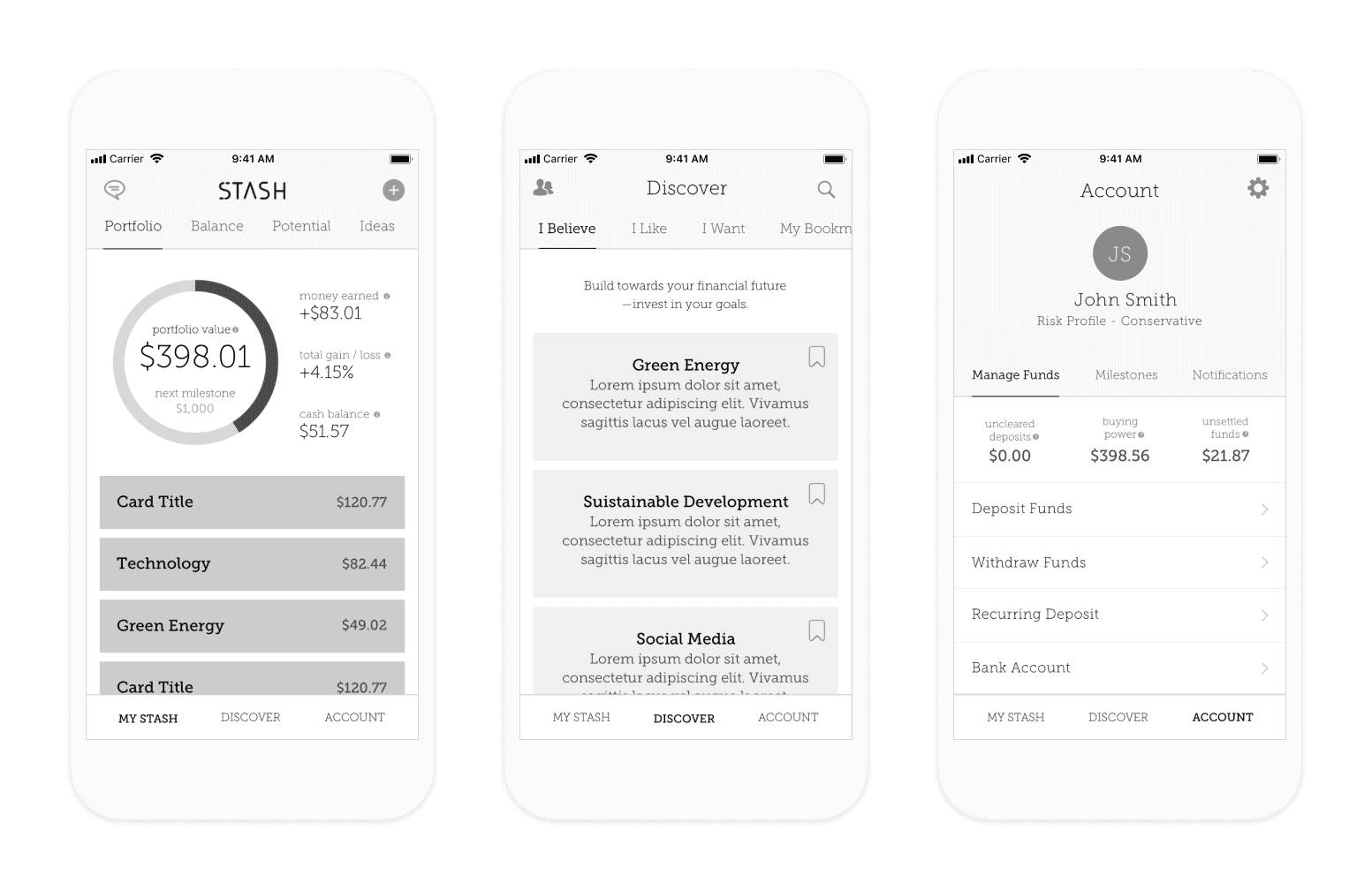
Then, I ran a card-sorting exercise to identify the most intuitive navigation and finalize the app experience.
Don’t Panic and Don’t Be a Day Trader
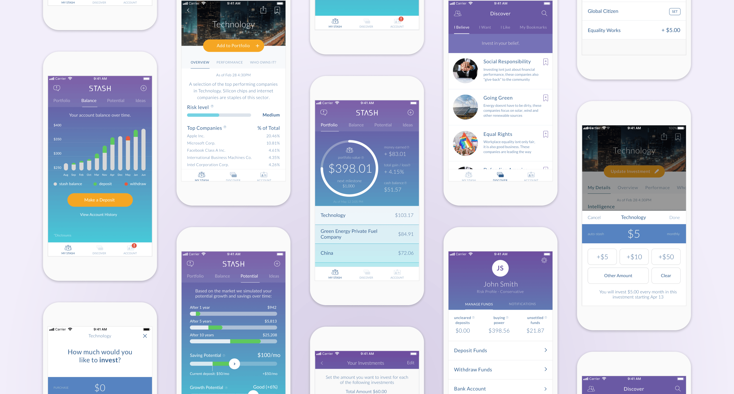
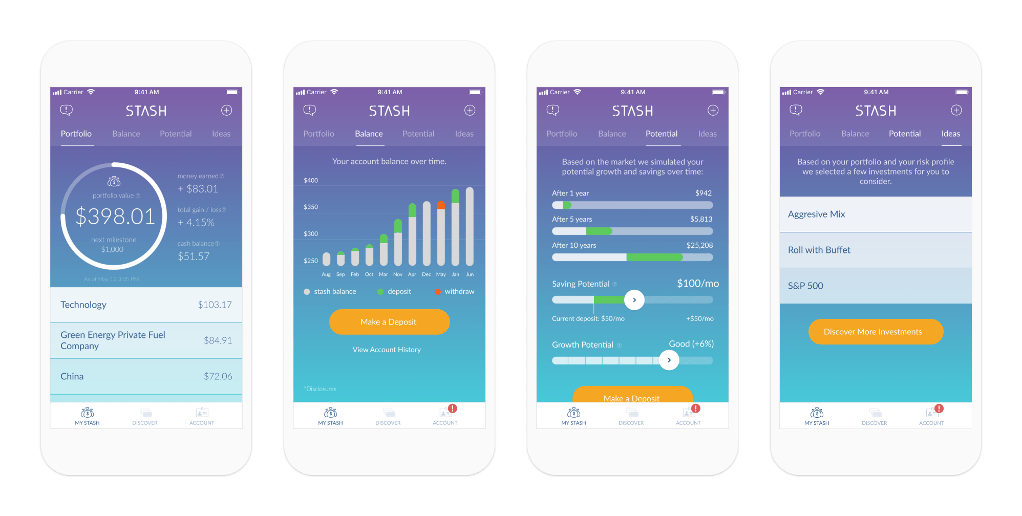
Investment dashboards can be intimidating and lead to hasty, emotional decisions. I limited the performance indicators to focus on long-term gains and ensure steady account balances – an important factor for Stash's survival.
Additionally, I created "milestones" which serve as targets for the overall value of the user's portfolio, motivating them to grow their investments.
At Your Own Pace
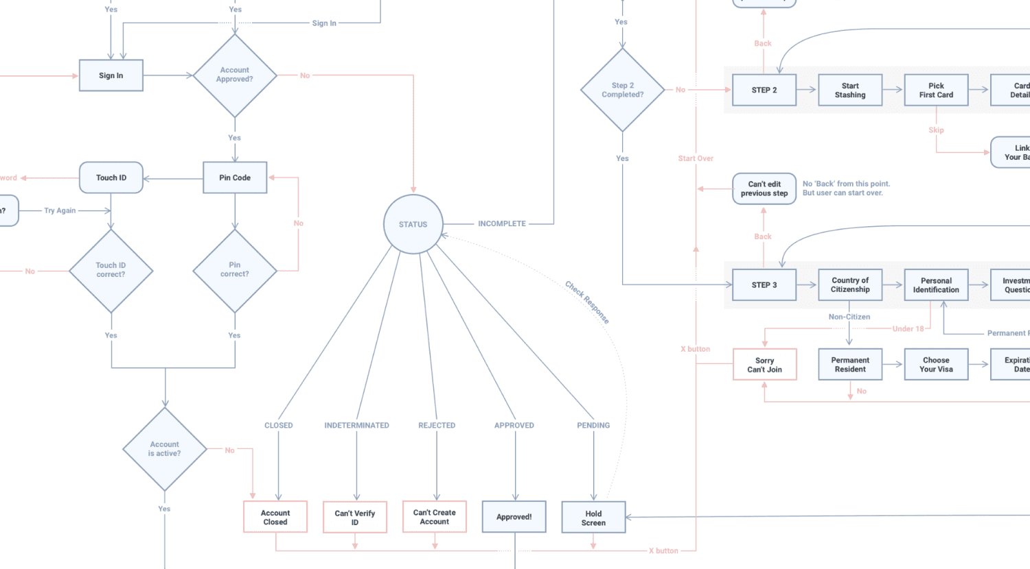
In order to comply with regulations, we had to ask our new users a lot of questions during the sign-up process. To make this process less overwhelming, I broke it down into three steps. This way, users can see their progress and also have the option to leave and come back later without starting over.
As part of the sign-up flow, people were given the ability to choose their first investments. This gave them an early taste of how investing with Stash worked and the motivation to finish signing up.
Automatic Investments
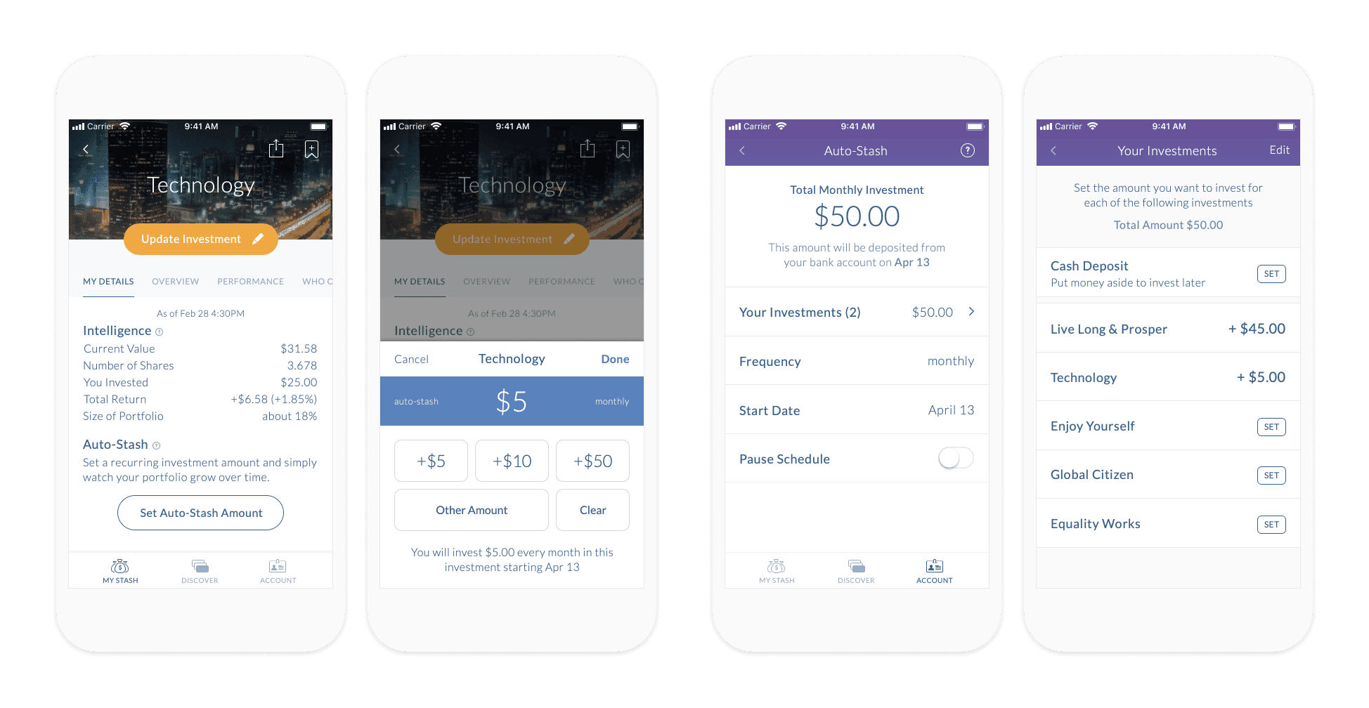
During testing, we also discovered that people didn’t understand the concept of “savings” in Stash. Asking them to take $10 a month out of their account was a tough sale when they were not confident with their investing skills.
I conducted an experiment where the messaging emphasized owning more of a specific investment rather than depositing more money. This approach resulted in a more favorable response to the feature and led to increased deposits. Although the end result was the same, the emotional reaction was significantly different.
Outcome
Since launching on October 14, 2015, Stash has amassed over 2 million customers and nearly $3B in assets under management.
Takeaways
Developing Stash was enlightening and enriching. I gained insights into the world of fintechs and a deeper understanding of regulatory frameworks and their impact on product design. Reflecting on this journey, I am grateful for the lessons learned and the growth experienced.
